Messages
Message Information
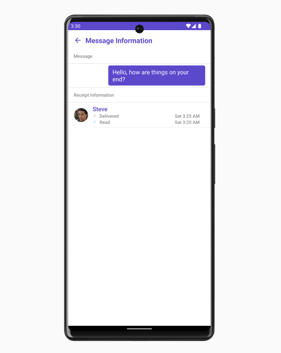
The MessageInformation is a Component designed to display message-related information, such as delivery and read receipts. It serves as an integral part of the CometChat UI UI Kit, extending the ListBase class, which provides the underlying infrastructure for CometChat UI components. With its rich set of methods and properties, developers can easily customize and tailor the appearance and behavior of the message information view to suit the specific requirements of their application.
 MessageInformation is comprised of the following Base Components:
The following properties are exposed by MessageInformationStyle:
Below is a list of customizations along with corresponding code snippets

| Base Components | Description |
|---|---|
| List Base | This renders common components used across Conversations, Groups & Users. |
Usage
Integration
The following code snippet illustrates how you can directly incorporate the MessageComposer component into yourlayout.xml file.
Actions
Actions dictate how a component functions. They are divided into two types: Predefined and User-defined. You can override either type, allowing you to tailor the behavior of the component to fit your specific needs.1. OnBackPress
TheOnSendButtonClick event is typically triggered when the back button is pressed and it carries a default action. However, with the following code snippet, you can effortlessly override this default operation.
2. onError
This action doesn’t change the behavior of the component but rather listens for any errors that occur in the MessageList component.Filters
MessageInformation component does not have any available filters.Events
MessageInformation component does not have any available events.Customization
To fit your app’s design requirements, you can customize the appearance of the MessageInformation component. We provide exposed methods that allow you to modify the experience and behavior according to your specific needs.Style
Using Style you can customize the look and feel of the component in your app, These parameters typically control elements such as the color, size, shape, and fonts used within the component.1. MessageInformation Style
To modify the styling, you can apply the MessageInformationStyle to the MessageInformation Component using thesetStyle method.
| Property | Description | Code |
|---|---|---|
| SubtitleText Color | Sets the text color for the subtitle | setSubtitleTextColor(@ColorInt int) |
| SubtitleText Appearance | Sets the text appearance for the subtitle | setSubtitleTextAppearance(@StyleRes int) |
| Title Font | Sets the font for the title | setSubtitleTextAppearance(@StyleRes int) |
| EmptyText Font | Sets the font for the empty state text | setEmptyTextFont(String emptyTextFont) |
| EmptyText Appearance | Sets the text appearance for the empty state text | setEmptyTextAppearance(@StyleRes int ) |
| ErrorText Appearance | Sets the text appearance for the error state text | setErrorTextAppearance(@StyleRes int ) |
| ErrorText Appearance | Sets the text appearance for the error state text | setErrorTextAppearance(@StyleRes int ) |
| ErrorText Appearance | Sets the text appearance for the error state text | setErrorTextAppearance(@StyleRes int ) |
| Title Color | Sets the text color for the title | setTitleColor(@ColorInt int) |
| BackIcon Tint | Sets the tint color for the back icon | setBackIconTint(@ColorInt int) |
| OnlineStatus Color | Sets the text color for the online status | setOnlineStatusColor(int onlineStatusColor) |
| Separator Color | Sets the color for the separator | setSeparatorColor(@ColorInt int) |
| LoadingIcon Tint | Sets the tint color for the loading icon | setLoadingIconTint(@ColorInt int) |
| EmptyText Color | Sets the text color for the empty state text | setEmptyTextColor(@ColorInt int |
| MessageTitle Appearance | Sets the text appearance for the message title | setMessageTitleAppearance(@StyleRes int) |
| MessageInformationTitle Appearance | Sets the text appearance for the message information title | setMessageInformationTitleAppearance(@StyleRes int) |
| MessageText Color | Sets the text color for the message text | setMessageTextColor(@ColorInt int) |
| MessageInfoText Color | Sets the text color for the message info text | setMessageInfoTextColor(@ColorInt int) |
| Background Color | Sets the background color | setBackground(@ColorInt int) |
| Background Drawable | Sets the drawable background | setBackground(Drawable) |
| Corner Radius | Sets the corner radius | setCornerRadius(float cornerRadius) |
| Border Width | Sets the width of the border | setBorderWidth(int borderWidth) |
| Border Color | Sets the color of the border | setBorderColor(int borderColor) |
2. ListItem Style
To apply customized styles to theListItemStyle component in the MessageInformation Component, you can use the following code snippet. For more information, visit List Item Styles.
3. Avatar Style
To apply customized styles to theAvatar component in the MessageInformation Component, you can use the following code snippet. For more information, visit Avatar.
4. MessageBubble Style
To apply customized styles to theMessageBubble component in the MessageInformation Component, you can use the following code snippet. For further insights on MessageBubble Styles refer
Functionality
These are a set of small functional customizations that allow you to fine-tune the overall experience of the component. With these, you can change text, set custom icons, and toggle the visibility of UI elements.| Property | Description | Code |
|---|---|---|
| -------- | ----------- | ---- |
| Set Message | Sets the message to be displayed in the message information view. | setMessage(BaseMessage message) |
| ErrorView Visibility | Sets the message to be displayed in the message information view. | setMessage(BaseMessage message) |
How to integrate CometChatMesssageInformation ?
SinceCometChatMesssageInformation is a Widget, it can be added directly to the layout file as shown below.
Methods
| Methods | Parameters | Description |
|---|---|---|
| setTemplate(CometChatMessageTemplate template) | CometChatMessageTemplate | Sets a custom message template for the message information view. |
| setMessage(BaseMessage message) | BaseMessage | Sets the message to be displayed in the message information view. |
| setErrorViewVisibility(int visibility) | int | Sets the visibility of the error view in the message information view. |
| setTitle(String title) | String | Sets the title that will be displayed at the top of the CometChatContacts view. This method allows you to customize the title to provide relevant information or context to the users. |
| setListItemView(Function3<Context, BaseMessage, MessageReceipt, View> listItemView) | Function3<Context, BaseMessage, MessageReceipt, View> | Sets a custom list item view for individual entries in the message information view. |
| public void setSubtitleView(Function3<Context, BaseMessage, MessageReceipt, View> subtitleView) | Function3<Context, BaseMessage, MessageReceipt, View> | Sets a custom subtitle view for individual entries in the message information view. |
| setReceiptDatePattern(Function1<MessageReceipt, String> datePattern) | Function1<MessageReceipt, String> | Sets a custom date pattern for formatting receipt dates in the message information view. |
| setStyle(MessageInformationStyle style) | MessageInformationStyle | Sets the overall style and appearance for the message information view. |
| setReadIcon(@DrawableRes int readIcon) | @DrawableRes int | Sets the custom icon resource for read receipts in the message information view. |
| setDeliveredIcon(@DrawableRes int deliverIcon) | @DrawableRes int | Sets the custom icon resource for delivered receipts in the message information view. |
| setListItemStyle(ListItemStyle listItemStyle) | ListItemStyle | Sets the style for list items in the message information view. |
| setAvatarStyle(AvatarStyle avatarStyle) | AvatarStyle | Sets the style for avatars in the message information view. |
| setError(OnError onError) | OnError | Sets the error callback to handle any errors that may occur within the message information view. |
| emptyStateText(String message) | String | Sets the text to be displayed in the empty state view of the message information view. |
| errorStateText(String errorText) | String | Sets the error message to be displayed in the error state view of the message information view. |
| setEmptyStateView(@LayoutRes int id) | @LayoutRes int | Sets the custom layout resource for the empty state view of the message information view. |
| setErrorStateView(@LayoutRes int id) | @LayoutRes int | Sets the custom layout resource for the error state view of the message information view. |
| setLoadingStateView(@LayoutRes int id) | @LayoutRes int | Sets the custom layout resource for the loading state view of the message information view. |
| setBubbleView(Function2<Context, BaseMessage, View> bubbleView) | Function2<Context, BaseMessage, View> | This method allows you to set a custom bubble view in the message information Component. |
| setMessageBubbleStyle(MessageBubbleStyle messageBubbleStyle) | MessageBubbleStyle | The setMessageBubbleStyle method is used to set the style and appearance of the message bubble in the CometChatMessageInformation component. |
| backIcon(@DrawableRes int res) | @DrawableRes int | The back button is typically displayed at the top-left corner of the message information view, and it allows users to navigate back to the previous screen or close the message information view. |
| addOnBackPressListener(OnBackPress onBackPress) | OnBackPress | This listener is triggered when the back button is pressed within the CometChatMessageInformation view. It provides a way to handle the back button press event and implement custom behavior. |
MessageInformationStyle
This property is used to customize the appearance of theCometChatMesssageInformation component.
| Methods | Parameters | Description |
|---|---|---|
| setSubtitleTextColor(int subtitleTextColor) | @ColorInt int | Sets the text color for the subtitle |
| setSubtitleTextAppearance(int subtitleTextAppearance) | @StyleRes int | Sets the text appearance for the subtitle |
| setTitleFont(String titleFont) | String | Sets the font for the title |
| setEmptyTextFont(String emptyTextFont) | String | Sets the font for the empty state text |
| setTitleAppearance(int titleAppearance) | @StyleRes int | Sets the text appearance for the title |
| setEmptyTextAppearance(int emptyTextAppearance) | @StyleRes int | Sets the text appearance for the empty state text |
| setErrorTextAppearance(int errorTextAppearance) | @StyleRes int | Sets the text appearance for the error state text |
| setTitleColor(int titleColor) | @ColorInt int | Sets the text color for the title |
| setBackIconTint(int backIconTint) | @ColorInt int | Sets the tint color for the back icon |
| setOnlineStatusColor(int onlineStatusColor) | @ColorInt int | Sets the text color for the online status |
| setSeparatorColor(int separatorColor) | @ColorInt int | Sets the color for the separator |
| setLoadingIconTint(int loadingIconTint) | @ColorInt int | Sets the tint color for the loading icon |
| setEmptyTextColor(int emptyTextColor) | @ColorInt int | Sets the text color for the empty state text |
| setErrorTextColor(int errorTextColor) | @ColorInt int | Sets the text color for the error state text |
| setMessageTitleAppearance(int messageTitleAppearance) | @StyleRes int | Sets the text appearance for the message title |
| setMessageInformationTitleAppearance(int messageInformationTitleAppearance) | @StyleRes int | Sets the text appearance for the message information title |
| setMessageTextColor(int messageTextColor) | @ColorInt int | Sets the text color for the message text |
| setMessageInfoTextColor(int messageInfoTextColor) | @ColorInt int | Sets the text color for the message info text |
| setBackground(int background) | @ColorInt int | Sets the background color |
| setBackground(Drawable drawableBackground) | Drawable | Sets the drawable background |
| setCornerRadius(float cornerRadius) | float | Sets the corner radius |
| setBorderWidth(int borderWidth) | int | Sets the width of the border |
| setBorderColor(int borderColor) | int | Sets the color of the border |

